
Brand Guidelines
Brand Guidelines
Origin of the ALBACONNECT Name
ALBACONNECT combines two words: ALBA and CONNECT.
"ALBA" stands for new beginnings and possibility; "CONNECT" for the stance of linking people, information and organisations.
By connecting different knowledge, technologies and organisations and drawing out the strengths of each, we build the foundation on which new value is created. This name reflects that role of ALBACONNECT.
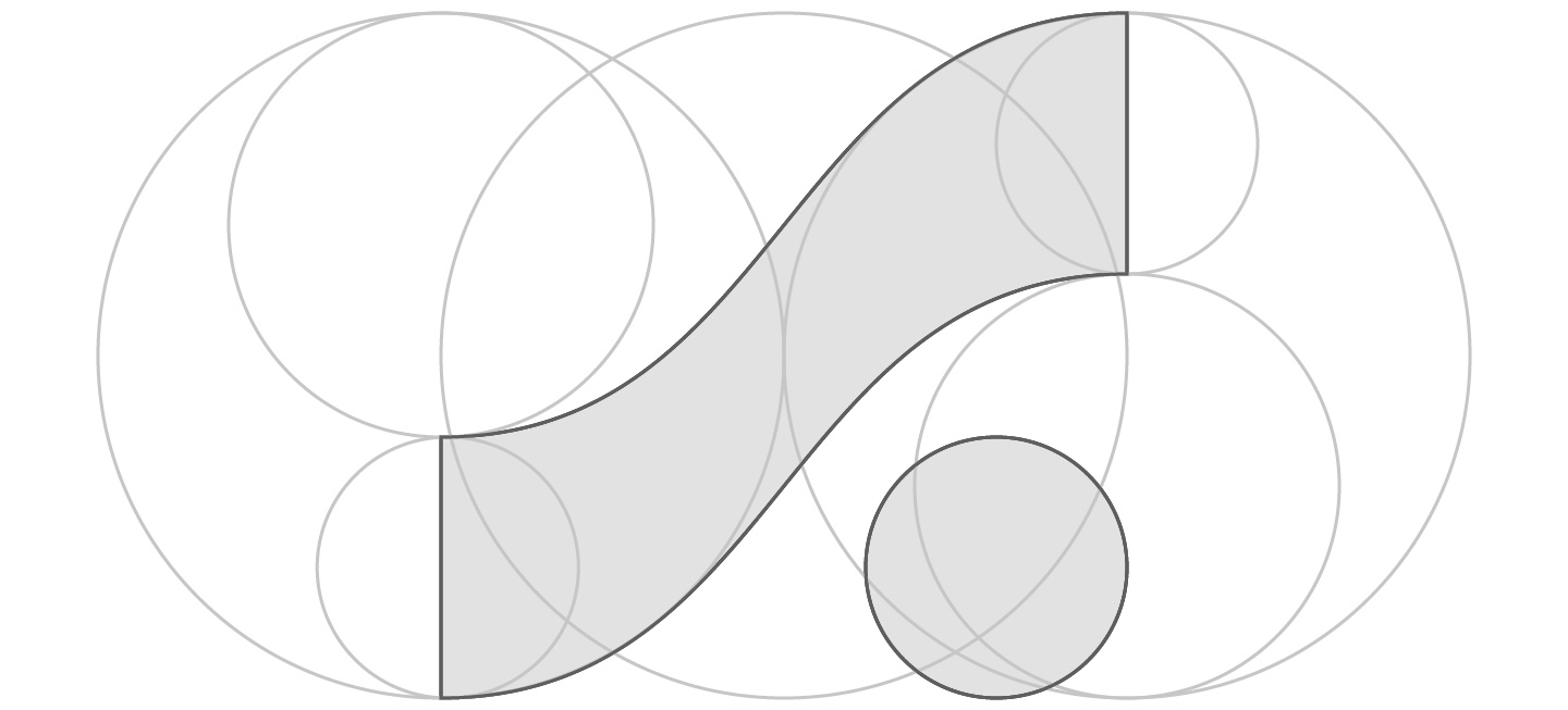
Logo construction — the geometric structure used to design the symbol.
Logo
Logo Usage
The logo is a symbol that visualises the "connection" and "creation of value" that ALBACONNECT prioritises.
Through a structure of overlapping circles and curves, it expresses how people, information and organisations connect to form a single flow.

Primary / Light Theme
SVG
Horizontal / Light Theme
SVG
Vertical / Light Theme
SVGPrimary / Dark Theme
SVGHorizontal / Dark Theme
SVGVertical / Dark Theme
SVGUsage
- Articles, press, partners and customers are welcome to use these SVGs as-is when referring to ALBACONNECT.
- Use the light-theme logo on light backgrounds and the dark-theme logo on dark backgrounds, keeping enough contrast for legibility.
- Download the required format from the cards above (SVG).
- For uses that might be confused with an official ALBACONNECT mark (services, products, or anything implying endorsement), please get in touch first.
Don'ts
- Do not alter the aspect ratio
- Do not change the colours
- Do not rotate the logo
- Do not add shadows or gradients
- Do not change the relationship between the logotype and symbol
- Do not place it on low-contrast backgrounds
- Do not crop any part of it
- Do not place other text or shapes too close to it
Color Palette
Brand Colors
ALBACONNECT's primary colour is blue.
Blue is the brand's primary colour, expressing trust, sincerity and stability. Use it for the logo, headings, primary UI and important guidance.
Use the defined shade for each purpose, and ensure sufficient contrast between text and background.
Primary
#0056D0
The brand's primary colour. Used for the logo, headings, primary UI and important guidance to keep the brand consistent — a blue chosen to convey trust, sincerity and stability.
Primary 40 / Base · #0056D0 · R0 G86 B208 — Primary buttons, links, emphasis and the logo
#001847
Primary 10
Darkest
#002C72
Primary 20
Dark
#0040A0
Primary 30
Deep
#0056D0
Primary 40
Primary
Base
#126EFF
Primary 50
Hover
#5A8CFF
Primary 60
Accent
#88A9FF
Primary 70
Lighter
#B1C5FF
Primary 80
Light surface
#DAE2FF
Primary 90
Tint band
Secondary
#006685
A supporting colour for information design. Used for data, structure and supplementary information to improve visibility and order — a blue-green chosen to convey rationality, transparency and clarity.
Secondary 40 / Base · #006685 · R0 G102 B133 — Data, structure and supplementary information
#001F2A
Secondary 10
Darkest
#003547
Secondary 20
Dark
#004D65
Secondary 30
Deep
#006685
Secondary 40
Secondary
Base
#0081A7
Secondary 50
Hover
#009CCA
Secondary 60
Accent
#00B9EE
Secondary 70
Lighter
#6DD2FF
Secondary 80
Light surface
#BFE9FF
Secondary 90
Tint band
Tertiary
#8424DA
An accent colour. Used when communicating new initiatives to give breadth to the message — a purple chosen to convey creativity, suppleness and progressiveness.
Tertiary 40 / Base · #8424DA · R132 G36 B218 — Accent for communicating new initiatives
#2C0051
Tertiary 10
Darkest
#490081
Tertiary 20
Dark
#7B20BE
Tertiary 30
Deep
#8424DA
Tertiary 40
Tertiary
Base
#9F47F5
Tertiary 50
Hover
#B56EFF
Tertiary 60
Accent
#C994FF
Tertiary 70
Lighter
#DCB8FF
Tertiary 80
Light surface
#F0DBFF
Tertiary 90
Tint band
Quaternary
#B6250A
A colour for important information and alerts. Used for errors, warnings and anything that must not be missed — chosen for high visibility and a measured sense of tension without overpowering the page.
Quaternary 40 / Base · #B6250A · R182 G37 B10 — Errors, warnings and critical alerts
#3E0400
Quaternary 10
Darkest
#650B00
Quaternary 20
Dark
#8E1400
Quaternary 30
Deep
#B6250A
Quaternary 40
Quaternary
Base
#D93F23
Quaternary 50
Hover
#FD5839
Quaternary 60
Accent
#FF8A73
Quaternary 70
Lighter
#FFB4A5
Quaternary 80
Light surface
#FFDAD3
Quaternary 90
Tint band
Neutral
#5E5E5E
A base colour set that supports information design. Used widely for text, borders and surfaces to carry readability and visibility — letting the other colours stand out while keeping the experience consistent.
Neutral 40 / Base · #5E5E5E · R94 G94 B94 — Text, borders and surfaces as the base tone
#1B1B1B
Neutral 10
Darkest text
#303030
Neutral 20
Heading
#474747
Neutral 30
Body
#5E5E5E
Neutral 40
Secondary text
Base
#777777
Neutral 50
Meta
#919191
Neutral 60
Icon
#ABABAB
Neutral 70
Border
#C6C6C6
Neutral 80
Border (soft)
#E2E2E2
Neutral 90
Divider
Typography
Typography
For Japanese, we use Zen Kaku Gothic New.
Prioritise readability in body text and a clear information hierarchy in headings, using the defined size, weight and line-height for each purpose.
For alphanumerics we use Manrope, paired with the Japanese typeface.
Zen Kaku Gothic New
JapaneseZen Kaku Gothic New has clean, linear letterforms with strong visibility and readability, making it well suited to digital environments.
人類社会のすべての構成員の固有の
すべての人間は、生れながらにして自由であり、かつ、尊厳と権利とについて平等である。
すべての人間は、生れながらにして自由であり、かつ、尊厳と権利とについて平等である。
Manrope
AlphanumericABCDEFGHIJKLM abcdefghijklm 0123456789
| Use | Font | Size | Weight | Line height | Letter spacing |
|---|---|---|---|---|---|
| Page title / H1 | Zen Kaku Gothic New | clamp(32px, 4.5vw, 56px) | 700 | 1.2 | -0.025em |
| Section heading / H2 | Zen Kaku Gothic New | clamp(26px, 3.2vw, 38px) | 700 | 1.375 | -0.025em |
| Body | Zen Kaku Gothic New | 15–16px | 400 | 1.95 | — |
| Lead | Zen Kaku Gothic New | 15–16px | 400 | 1.95 | — |
| Button | Zen Kaku Gothic New | 14px | 700 | 1.0 | 0.02em |
| Label (EN) | Manrope | 11px | 600–700 | — | 0.14em |
| Alphanumeric | Manrope | 15–16px | 400–700 | 1.95 | — |
Voice & Tone
Voice & Tone
In ALBACONNECT's writing, we prioritise facts and structure and lead with the conclusion, kept concise.
We avoid abstract metaphor and excessive emotional expression, making clear who we serve, what we provide and how.
When using technical terms, we add explanation appropriate to the reader; when showing results or effects, we use expressions whose basis can be verified.
Lead with the conclusion
Write the most important point first, then explain the reasons and details.
Make abstract words concrete
Don't rely on words like "innovation", "possibility" or "future" alone — state the subject, action and change.
Avoid exaggeration
Don't use unfounded superlatives or expressions that guarantee outcomes.
Keep terminology consistent
Don't refer to the same thing by multiple names — keep service, feature and role names consistent.
CONTACT
We support AI and system adoption that drives business growth.
From shaping the concept through design, development and operation, we support your use of AI and systems end-to-end.